Saturday 25 August 2012

Final Environment For Video Game - Board Game Style


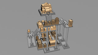
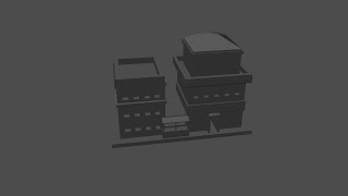
These are some stills from my final environment. The image above is from the final platform. The toon effect which I have applied to the models is supposed to be like a piece from a board game.

The reason that I have made the models this colour is because I wanted them to look like board game pieces, kind of like chess or draft pieces.
This effect was necessary to my design because my video game is supposed to look similar to a board game.


These next two images are overview shots of my final environment. I decided that I would use lots of columns and platforms which worked as stages for player to move up. There are three main levels to the game, but there are some sub levels which add extra spaces for the players to move along.


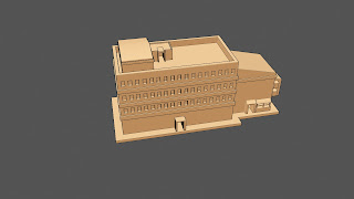
These images are from the Patrician level of my ancient Roman structure. The buildings that I used for this level were much more grand than the buildings on the Plebeian level. Buildings which were on this social level were much more spacious than buildings such as Insulae. People who owned these houses were middle too upper class people.


The remaining images are from the bottom level of my structure. The bottom platform of my structure is the the plebeian level.


These tiny square shapes in the image above act as stepping stones for each of the players counters. On this first platform there are three different ways that players can move through to get to the steps.


The small platform in the left hand side of the image above is were each player starts. 


More 3D Models

In this post are a few screen-shots of my final structure in which my game will be played on.


After I got the right layout for my structure I started adding a toon outline to it. At first I just added the default toon outline to my models. However this made some of the buildings outlines look too thick. If I am correct, for some of the more detailed models I changed the toon outline thickness from its default setting to about 0.2. This made the models look like they had a thin pen/pencil line around them.


I am pleased with the final layout of my 3D structure. Once I added the toon outline it really gave the models a new sense of definition.

Update on Company Name/Brand

After looking at my previous ideas for a brand name for my work/style I still couldn't come up with anything that suited me or that I actually liked until now.

I have decided to create a logo and a brand from adding two random words together. Two random words which I believe fit very well. The company name that I will be working on developing will be callled Bucket Fish.

I am not sure why I like this particular name but I find it really catchy. Over the near future I Hope to develop this by creating a logo and an ident

Texturing - Toon Shading

For this project I have been looking at creating a cel/toon shading effect to apply to my models. This was my first time using the toon shader which made it very exciting to explore and experiment with.


The colour that I have chosen for my models is a sandy coloured toon shader. This colour is a must for my models because it makes the models look like a board game pieces which is what I was going for.


Each of these models above really remind me of chess pieces. The board game style which I am going for is displayed in these toon screen-shots.


Friday 24 August 2012

Pre - Viz Layout

Just a quick post to show the development of my pre - viz layout. I decided that I should make a draft layout 
for how the environment could turn out. 

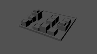
I started off off by just creating a base which represents a Roman board game. I then built up the environment by adding cubes. This gave me an idea for scale and placement of the buildings. 


The newer design for the project includes alot of columns and platforms. This pre - viz structure has three main levels. These levels are the Bottom level(plebeian), the middle level(patrician) and the top building which was the emperors level. This level is where the players must get to in order to win the game.


Production - Modelling

After creating lots of sketches and coming up with lots of ideas for possible buildings in my final environment, I have decided to start creating my 3d models.

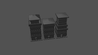
One of the first buildings that I created was influenced by an ancient Roman Insula. An Insula is an apartment building which was used by the lower class of ancient Roman people.


The image above is influenced by a Roman apartment building. When creating this 3d model I really tried to keep it as simplistic as possible, but without them just looking like a bunch of boxes.

Most of the Roman apartment buildings looked very generic. I have tried to add a little bit of detail to the models without making them overly complicated.

This is mainly for two reasons. The first reason that I am creating simplistic models is because of the device that the game will be played on. I do not want to create complicated models with alot of geometry because the game will struggle to run it smoothly.

The second reason for me choosing to follow a simplistic model style is because of the art style that I want my models to be.


Above are two more images of models which I have created using the 3d programme MAYA. These images are going to be used in my final environment for this project.


After doing a quick render using mental ray, I have created a small street using a selection of buildings which I created a few days ago.


When these simplistic models are put together they really begin to look much nicer. The images above and below are examples of this.


Silhouttes 2


After putting together some silhouettes I decided that I should try and add some minor outlines to give them more depth.


I started off by looking at the Roman Forum. This gave me the idea painting lots of random shapes and fitting them together. Once I had an initial shape I decided to use the dodge tool in photoshop to outline some basic details into my images.


The two images above are results of these tests. I feel that by creating these shapes it has given me a basic structure to work with.